메인 컨텐츠 화면
Fresher & safer agrofoods
Introduction of the Institute
- HOME
- Introduction of the Institute
- Gyeonggi agrofood Institute
- CI & BI
CI & BI
A new face of Gyeonggi agroFood Institute, new symbol & logo of Gyeonggi agroFood Institute.
The new symbol & logo of Gyeonggi agroFood Institute is a wordmark of GFI, the initial of Gyeonggi agroFood Institute and expresses Gyeonggi agroFood Institute in a clear and honest way.
The new symbol & logo of Gyeonggi agroFood Institute is a wordmark of GFI, the initial of Gyeonggi agroFood Institute and expresses Gyeonggi agroFood Institute in a clear and honest way.

Symbol mark
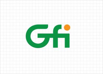
- Motif : Communication(distribution), sharing and convergence
-
Meaning : It expresses an organization which creates the value of consumption and production of agrofoods by connecting platforms of agrofood distribution, sharing economy and rural community value convergence as one.
An orange circle means an appearance of vitalizing like vitamins through well-established agrofood platforms and the coexistence of urban and rural community - Color : Applied green symbolizing safe agrofoods and orange symbolizing joy and happiness through foods
-
Color of the symbol mark
-
PANTONE 355C
C85 M10 Y100 K10
R0 G148 B68
-
PANTONE 1375C
C0 M50 Y100 K0
R247 G148 B30
-
PANTONE 355C
Logo type
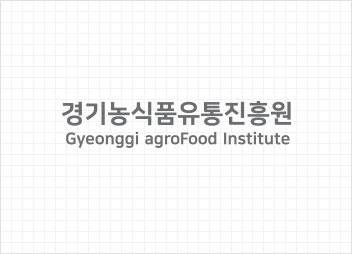
- A logo type is a visual identity which only consists of characters excluding graphic elements from a corporate symbol. The corporate symbol should preferentially be used in principle, but in case that it is impossible to use the corporate symbol for various reasons, the logo type may be used instead.
-
Color of the logo type
-
PANTONE 425C
C70 M70 Y70 K70
-
PANTONE 425C
Signature
A signature can be used by combining the symbol and the logo horizontally or vertically according to certain criteria in consideration of the place where it is used.
A mixture of Korean and English
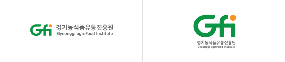
English